Free Tool: Extract the Perfect Colour Palette from Any Image
As a Squarespace website designer, I know that choosing the right colour palette can make or break your website's design. It's one of the first questions clients ask me: "What colours should I use for my brand?"
Today, I'm excited to share a free tool I've created that makes colour selection effortless and intuitive: the Mood Palette Color Extractor.

Why Colour Matters for Your Website
Your website's color palette does more than just look pretty—it:
Sets the emotional tone for your brand
Improves user experience by creating visual hierarchy
Increases conversion rates when used strategically
Builds brand recognition across all your marketing materials
But finding the perfect colors? That's where many business owners get stuck.
Introducing the Mood Palette Colour Extractor
I created this tool to solve a problem I see time and time again: clients have a beautiful inspiration image—maybe from their product photography, a mood board, or even a favourite piece of artwork—but they don't know how to translate those colours into their website design.
How It Works
The Mood Palette Colour Extractor is refreshingly simple:
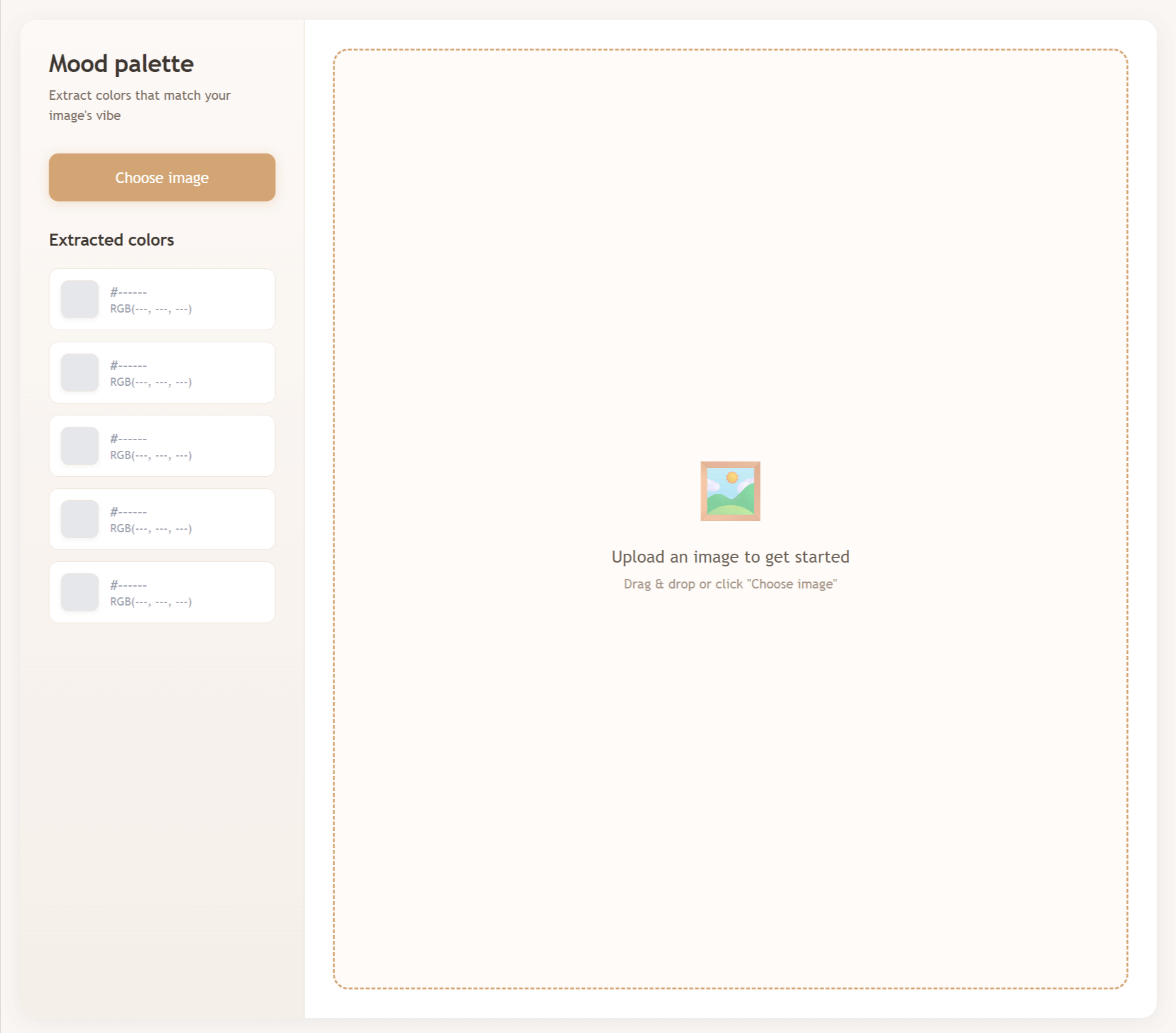
Upload any image - drag and drop or click to browse
Instantly see 5 dominant colors extracted from your image
Click any colour to copy the hex code to your clipboard
Drag the colour indicators on your image to fine-tune and sample specific colors
Use these colours directly in your Squarespace website design
Perfect For:
Brand designers looking to build cohesive colour schemes from client inspiration
Website owners who want their site colours to match their product photography
Squarespace DIY-ers who need help choosing professional-looking color combinations
Marketing materials creation - ensure consistency across all your brand touchpoints
Social media graphics that align with your website aesthetic
Give the Colour Palette tool a go!
Click this image to try the tool out
Real-World Applications
For E-commerce Stores
Upload a photo of your best-selling product and extract colours that will make your entire store feel cohesive and professional. This is particularly powerful for handmade goods, fashion boutiques, and lifestyle brands.
For Service-Based Businesses
Use an image that captures the mood you want clients to feel—calm, energised, luxurious, approachable—and build your entire website colour scheme around it.
For Content Creators
Extract colours from your photography style to create a consistent brand experience across your blog, social media, and website.
My Favorite Feature: Interactive Color Sampling
Here's where this tool really shines: you can drag the colour indicators directly on your uploaded image to sample any specific colour you want. See a subtle shade in the background that would be perfect for your website footer? Just drag a colour dot over it, and the hex code updates instantly.
This level of precision means you're not just getting "close enough" colours—you're getting exactly the shades that speak to you.
Why I Built This Tool
After 14+ years designing websites and working with hundreds of clients, I've learned that the best designs start with strong foundational elements. Colour is one of those elements.
I wanted to create something that:
Removes the guesswork from colour selection
Empowers business owners to make confident design decisions
Saves time for designers and DIY website builders alike
Makes professional design tools accessible to everyone
How to Use This with Your Squarespace Website
Once you've extracted your perfect palette:
Copy the hex codes from the tool
In your Squarespace dashboard, go to Design → Site Styles
Click on any colour selector (like accent colours, button colours, background colours)
Paste your hex code directly into the colour field
Watch your website transform with a cohesive, professional colour scheme
Tips for Choosing Your Source Image
To get the best results from the Mood Palette Colour Extractor:
Use high-quality images with good colour variation
Choose images that reflect your brand mood - vibrant and energetic, calm and minimal, bold and dramatic
Consider lighting - colours will vary depending on natural vs. artificial light in your photos
Test multiple images - sometimes the second or third try reveals the perfect palette
Beyond the Basics: Strategic Colour Use
Once you have your palette, remember these professional tips:
The 60-30-10 Rule: Use your dominant colour for 60% of your design, your secondary colour for 30%, and your accent colour for 10%. This creates visual balance without overwhelming visitors.
Accessibility Matters: Ensure there's enough contrast between your text and background colours. The Web Content Accessibility Guidelines (WCAG) recommend a contrast ratio of at least 4.5:1 for normal text.
Test on Different Devices: Colours can appear differently on various screens. Check your website on mobile, tablet, and desktop to ensure consistency.
Try It Yourself
Ready to discover your perfect colour palette? Try the Mood Palette Colour Extractor now and see how easy it is to create a professionally designed colour scheme for your website.
Need Help Implementing Your New Colours?
While this tool makes colour selection simple, implementing a full brand refresh or website redesign involves many other strategic decisions. If you'd like expert guidance on:
Translating your colour palette into a complete Squarespace website design
Creating a cohesive brand identity across all touchpoints
Optimising your website for conversions and user experience
Technical Squarespace customisation and support
Let's have a chat about how I can help bring your vision to life.