Free Accessibility Tool: Colour Contrast Checker
Test your colour combinations for web accessibility compliance.
Make your website usable, easily readable and accessible for all.
Try the colour contrast checker!
How to Use the Colour Contrast Checker: A Complete Guide
Ensuring your website is accessible to everyone isn't just good practice—it's essential for creating an inclusive online experience. One of the most important aspects of web accessibility is colour contrast, which determines how easily visitors can read your content.
I've created a simple Colour Contrast Checker tool to help you test whether your colour combinations meet WCAG (Web Content Accessibility Guidelines) standards. Here's everything you need to know about using it.
Why Colour Contrast Matters
Before we dive into the tool, let's talk about why this matters. Proper colour contrast ensures that:
Visitors with visual impairments can read your content
People viewing your site in bright sunlight or on dim screens can still navigate easily
Your website meets legal accessibility requirements
Everyone has a better user experience
Poor contrast doesn't just affect people with disabilities—it impacts anyone who might be tired, distracted, or viewing your site in less-than-ideal conditions.
Understanding WCAG Standards
The tool tests your colour combinations against four key WCAG standards:
Normal Text AA (Level AA) - Requires a contrast ratio of at least 4.5:1. This is the minimum standard for regular body text and should be your baseline for most content.
Normal Text AAA (Level AAA) - Requires a contrast ratio of at least 7:1. This enhanced standard provides even better readability and is recommended for important content.
Large Text AA (Level AA) - Requires a contrast ratio of at least 3:1 for text that's 18pt and larger (or 14pt and bold). Large text is more readable, so the requirements are slightly relaxed.
Large Text AAA (Level AAA) - Requires a contrast ratio of at least 4.5:1 for large text. This provides optimal readability for headings and larger elements.
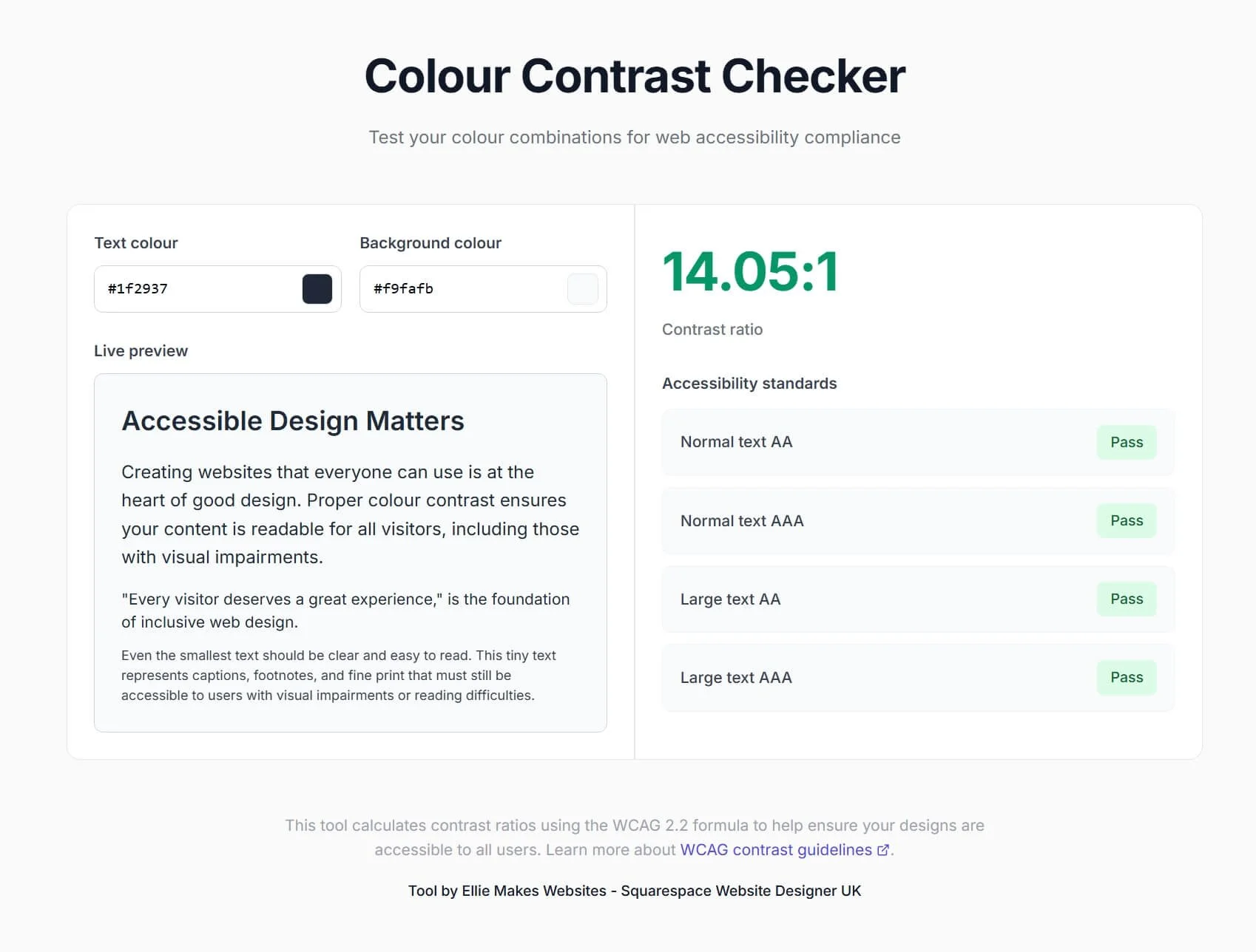
How to Use the Tool
Step 1: Enter Your Colours
The tool has two input fields at the top:
Text Colour - Enter the hex code of the colour you're using for your text (e.g., #1f2937). You can either type the hex code directly or click the colour swatch on the right to use a visual colour picker.
Background Colour - Enter the hex code of your background colour (e.g., #f9fafb). Again, you can type it or use the colour picker.
Step 2: Review the Live Preview
As soon as you enter your colours, the preview panel on the left shows you exactly how your colour combination looks in practice. You'll see:
A large heading
Regular paragraph text
Smaller text similar to captions or footnotes
This gives you an immediate visual sense of whether your colours work well together. If you're squinting or struggling to read the preview, that's a clear sign the contrast isn't sufficient.
Step 3: Check Your Contrast Ratio
On the right side of the tool, you'll see your contrast ratio displayed as a large number (e.g., 14.67:1). Higher numbers mean better contrast:
1:1 - No contrast at all (same colour)
3:1 - Minimum for large text
4.5:1 - Minimum for normal text
7:1 - Enhanced contrast
21:1 - Maximum contrast (black on white)
Step 4: Review Compliance
Below the contrast ratio, you'll see four compliance checks. Each one shows either "Pass" (in green) or "Fail" (in red), telling you whether your colour combination meets that particular standard.
For most websites, you should aim to pass at least Normal Text AA for all body copy. If you're designing for healthcare, government, or education sectors, or if you simply want to provide the best experience, aim for Normal Text AAA.
Practical Tips for Better Contrast
Start with Dark on Light - The easiest way to ensure good contrast is to use dark text on a light background. Black on white gives you the maximum contrast ratio of 21:1.
Test Your Brand Colours - If your brand colours don't provide sufficient contrast, you may need to use darker or lighter variations for text. Your brand colour might work beautifully for buttons and accents but need adjustment for body text.
Don't Rely on Colour Alone - Always use additional indicators beyond colour (like icons, underlines, or bold text) to convey important information.
Consider Different Text Sizes - Remember that larger text has more relaxed requirements. Your main heading in your brand colour might pass, while body text in the same colour might fail.
Test Multiple Combinations - Don't just test your body text. Check your navigation links, button text, form labels, and any overlay text on images.
Common Mistakes to Avoid
Light Grey on White - This is one of the most common contrast failures. That subtle #e0e0e0 grey you love might look elegant, but it's likely failing accessibility standards.
Coloured Text on Coloured Backgrounds - Be especially careful when using coloured text on coloured backgrounds. Blue on green, for example, often fails contrast requirements even when both colours seem distinct.
Text Over Images - If you're placing text over images, make sure there's sufficient contrast. Consider using overlays or ensuring the image area behind the text is consistently light or dark.
Assuming What Works for You Works for Everyone - Just because you can read something easily doesn't mean everyone can. Always test with the tool.
Making Adjustments
If your colour combination fails, here are some quick fixes:
Darken your text colour - Move from medium grey to dark grey or black
Lighten your background - Use a lighter shade of your background colour
Increase saturation - Sometimes a more saturated version of your colour provides better contrast
Use your colours differently - Save low-contrast colours for decorative elements rather than text
Beyond the Tool
Remember that colour contrast is just one aspect of web accessibility. You should also consider:
Font size and readability
Clear navigation structures
Alternative text for images
Keyboard navigation
Screen reader compatibility
Need Help with Your Website's Accessibility?
Creating an accessible website involves more than just colour contrast, though it's an excellent place to start. If you're building a new Squarespace website or want to audit your existing site for accessibility issues, I'd love to help.
As a Squarespace Circle Gold Partner and SEO Specialist, I ensure that every website I design meets accessibility standards whilst maintaining beautiful aesthetics and strong brand identity.
Ready to make your website accessible to everyone? Get in touch for a friendly chat about your web design needs.
Ellie Makes Websites is a freelance Squarespace website design agency based in Gloucester, Gloucestershire, UK, serving businesses across the UK and Europe. Specialising in accessible, SEO-optimised websites that don't just look beautiful—they perform.